Element that represents a control that provides a menu of options, collection of UI components used.
Alerts are used to communicate a state that affects a system, feature or page. They are used to provide feedback about an action that has taken place.
Buttons allow users to take actions and make choices, with a single click.
Form input controls like <input> and <textarea>. These fields will allow users to submit short and long form text input.
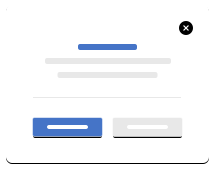
Modal dialogs present popup information to inform users of important information and sometimes allow the user to take action.
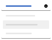
Selects create dropdowns for selecting a single entry from a list.
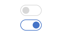
Switches render a single boolean toggle that has an off state and an on state.
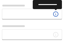
Informative message that appears when a user interacts with an element.